

Most people fear blank slides the way writers fear blank pages. But not you. You’ve got a vision (even if it’s a little fuzzy right now). Whether you’re building your first eLearning module or giving a dusty deck a makeover, a little design savvy can turn a training experience from “meh” into “meaningful.”
7 Design Principles
Let’s talk visual design. Not the “spend three years getting a degree” kind, but the real-world rules that help you build clean, compelling, scroll-stopping learning experiences.
No clutter. No chaos. Just solid design that makes your content look (and feel) intentional.
1. Contrast: Give Your Screens a Pulse
Contrast is the Beyoncé of design principles…it runs the show. Big versus small. Light versus dark. Bold versus thin. Good contrast helps learners instantly know what’s important.
Here’s how you use it:
- Light text on dark backgrounds (or vice versa)
- Headings that are clearly bigger, bolder, or weightier than your body text
- Accent colors that pop
Example: The “Good” contrast pairings below are bold, easy to read, and learner-friendly.
The “Bad” ones? Low visibility, harder to read, and easy to overlook.
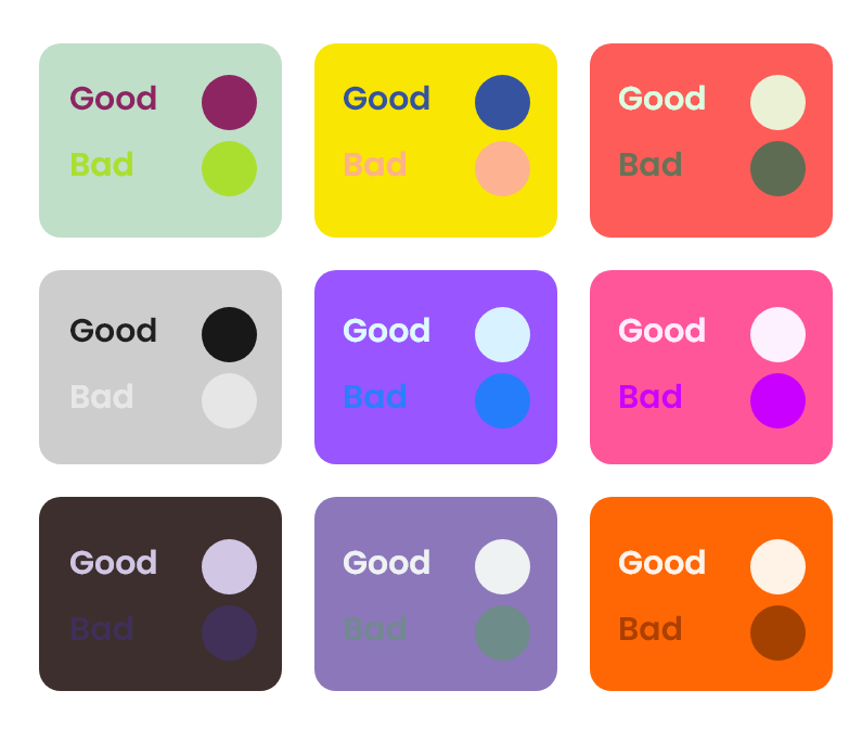
Diagram illustrating “good” versus “bad” contrast pairings.
♦️ Quick tip: Not sure if your colors are cutting it? Run them through a WCAG Color Contrast Checker. It’s like spellcheck, but for readability, and your learners’ eyes will thank you.
2. Alignment: Because Chaos Isn’t Chic
Alignment is what separates a sleek, intentional design from “I just dragged stuff around until it kinda looked okay.” When elements line up (e.g., left edges, center lines, even button placements) it tells your learners, “This was designed with care.” It brings structure, clarity, and a sense of polish to your layout.
Here’s how you use it:
- Pick a grid or layout and stick with it.
- Watch those edge-to-edge relationships (like logos, headings, and text blocks).
- Avoid “floating” text, instead anchor it with purpose.
Example: The “Good Alignment” example below keeps everything lined up along the same left edge: clean, intentional, and easy to read. In the “Bad Alignment” example, the heading and text blocks are misaligned, creating visual tension and making the content harder to follow.
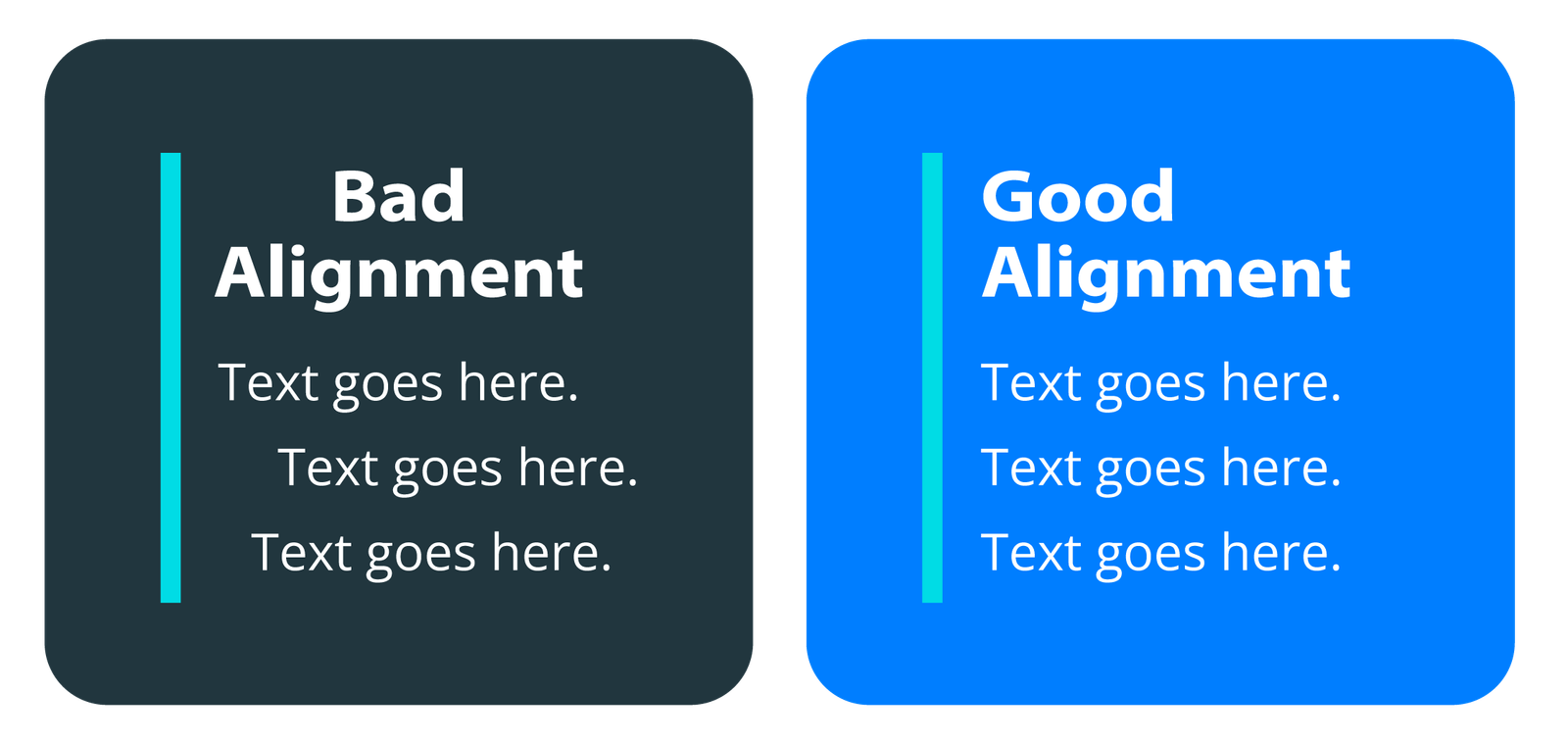
Diagram illustrating “good” versus “bad” alignment.
♦️ Designer’s secret: Use your design tool’s rulers and grids or draw imaginary lines to check alignment. If something’s off, nudge it until it snaps into place.
3. Proximity: Group Hugs for Your Content
If contrast is the diva, proximity is the therapist: here to help your content build healthy relationships. When things are close together, we assume they belong together. When they’re spaced out, we think they’re unrelated. Simple.
Here’s how you use it:
- Headings should hug the content they introduce.
- Buttons should stay with the items they control.
- Labels should stick to their icons.
Example: The “Good Proximity” example groups related elements, making relationships clear. The heading stays close to its content, and the button sits right where it belongs. In the “Bad Proximity” example, elements are too close or too far apart. The heading feels isolated, and the button looks disconnected from the content it supports.
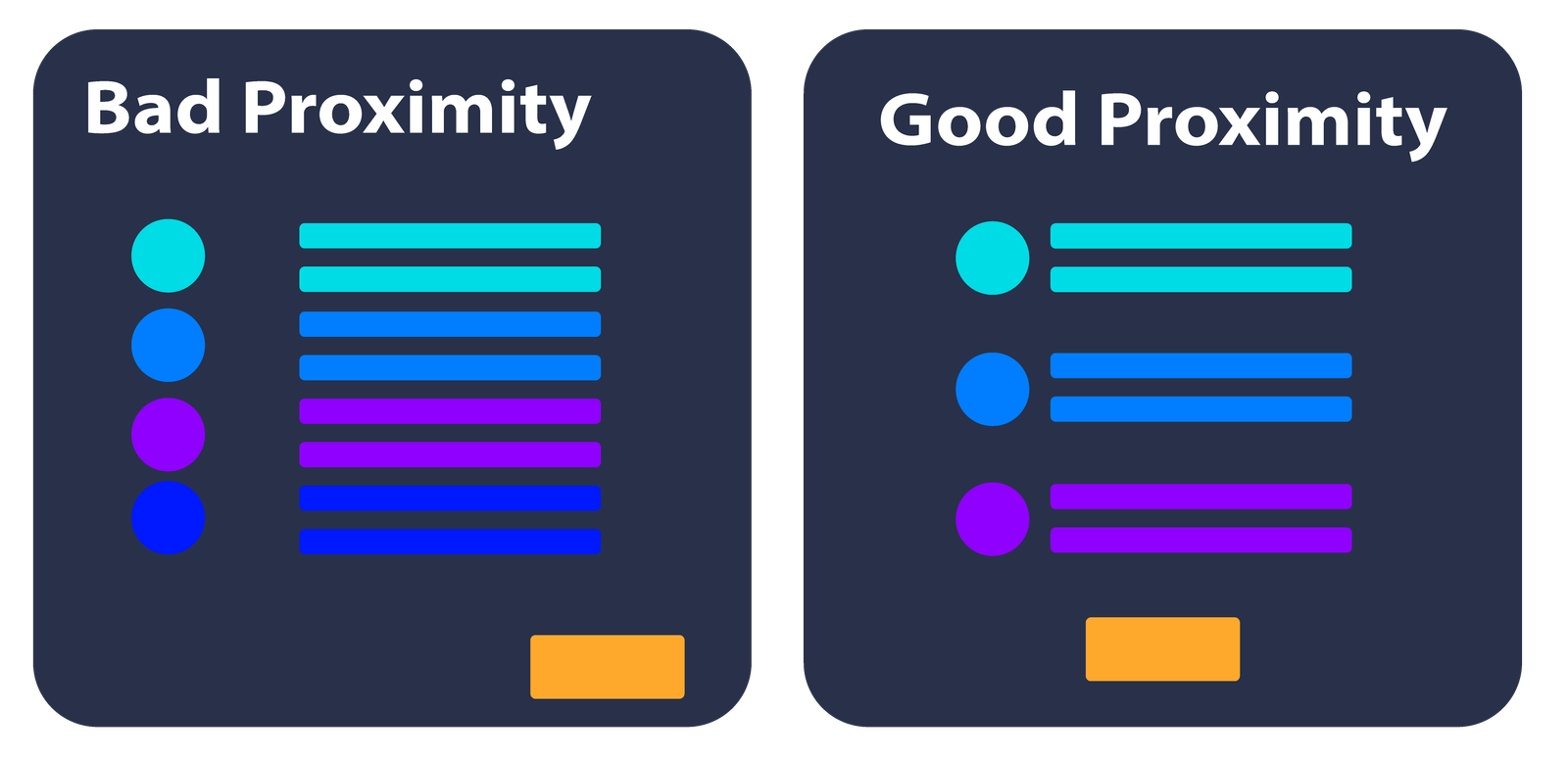
Diagram illustrating “bad” versus “good” proximity.
♦️ Rule of thumb: If your layout feels confusing, try shifting things closer or farther apart. Measure the the space between related items.
4. White Space: Let It Breathe
White space (aka negative space) is what isn’t on the screen, and it’s just as important as what is. It gives your designs room to breathe. It says, “I’m confident enough not to fill every inch with something loud and flashy.”
You can use it to:
- Create focus around key elements.
- Make your content easier to scan.
- Add a touch of elegance with minimalism.
Example: The “Good White Space” example leaves plenty of breathing room around each element. The layout feels balanced, clean, and easy to process. In the “Bad White Space” example, elements are packed too tightly. The design feels cramped, making it harder to focus and visually overwhelming.
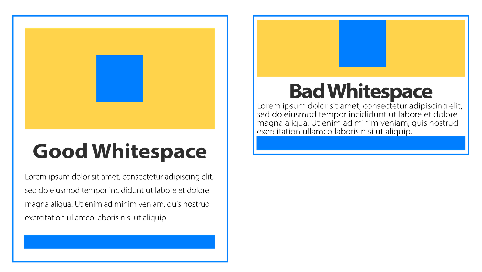
Diagram illustrating “good” versus “bad” use of whitespace.
♦️ Real talk: Crowded screens = mental fatigue. Give learners some breathing room and they’ll thank you with their attention.
5. Balance: Visual Feng Shui
Imagine your screen is a seesaw. Now, balance it.
Not with math, but with visual weight. Every element you place on the page carries some. That weight can come from size, color, shape, or even texture. To create balance, you need to scale and position your elements so nothing feels too heavy on one side.
Here’s how to spot (and fix) imbalance:
- Don’t overload one side of the layout.
- Distribute elements so the design feels stable and grounded.
- Make it easy for the eye to move across the screen.
Example: In the “Good Balance” example, all elements are evenly spaced, creating a layout that feels stable and easy to read. In the “Bad Balance” example, elements are stacked unevenly, making the design feel lopsided and harder to follow.
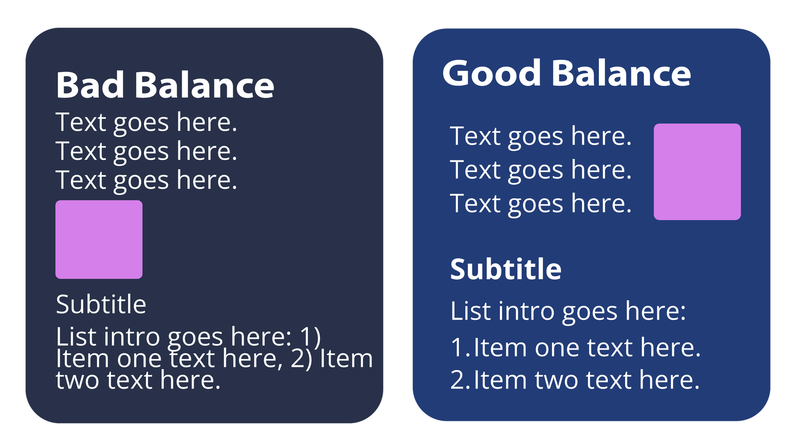
Diagram illustrating “good” versus “bad” balance.
♦️ Try this: Place your image on one side and your text on the other. Then squint. Does one side feel heavier? Shift things around until it feels just right.
6. Repetition: Brand It Like You Mean It
Repetition is what keeps your slides singing the same tune. When done right, it creates consistency, clarity, and trust.
Repeat things like:
- Fonts.
- Button styles.
- Color palette (pick a few and stick to them).
Example: The “Good Repetition” example uses consistent shapes, font styles, and formatting throughout, making the layout easy to follow and visually cohesive. In the “Bad Repetition” example, heading styles and shapes vary with each item. This lack of consistency feels unpolished and makes it harder for learners to recognize patterns or navigate the content confidently.
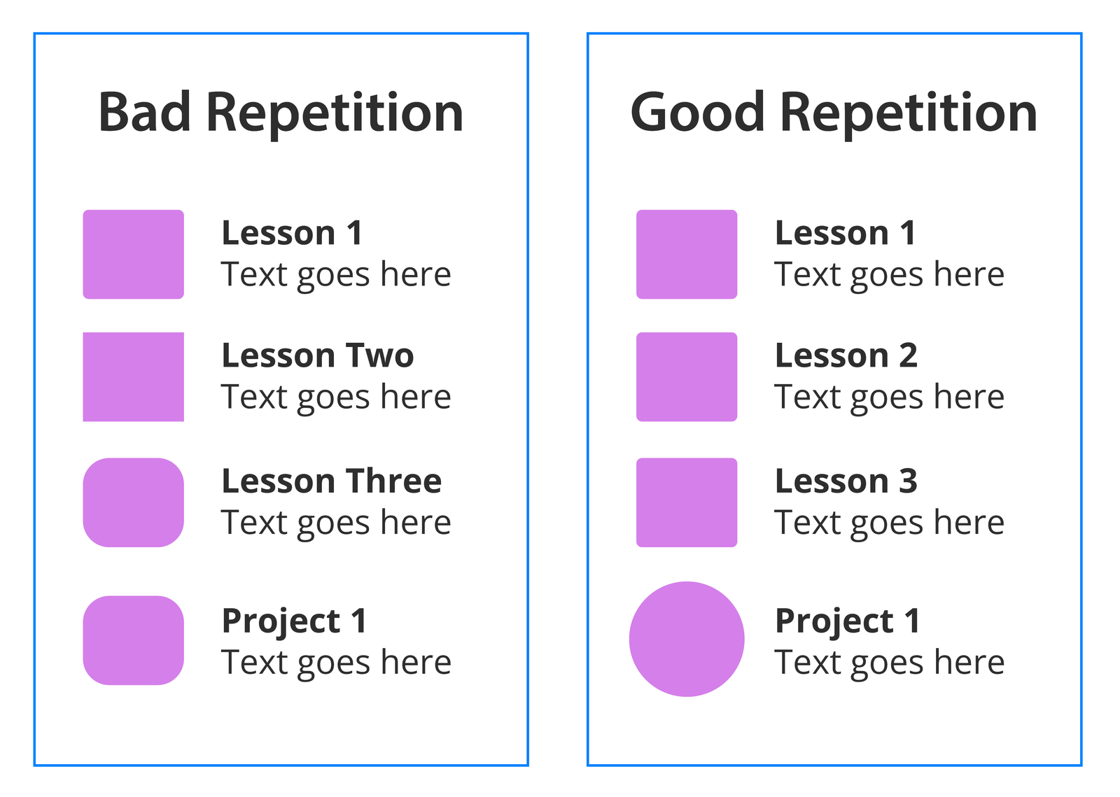
Diagram illustrating “good” versus “bad” repetition.
♦️ Golden rule: Repetition = recognition. Don’t make your learner re-learn how your course works every slide.
7. Hierarchy: Guide the Eye Like a Pro
Hierarchy is your slide’s way of whispering, “Hey, look here first.”
It’s the pecking order of your content, telling your learner what’s most important and what they can skim if they’re short on coffee.
Ways to build hierarchy:
- Use size, weight, and placement to emphasize key elements.
- Stack content top-down in order of importance.
- Use bold headers, subheads, and body copy consistently.
Example: The “Good Hierarchy” example uses clear differences in size and style to guide the eye: title first, then subheading, then body text. In the “Bad Hierarchy” example, everything blends together. The subheading competes with the title and the oversized body text confuses the reading order.
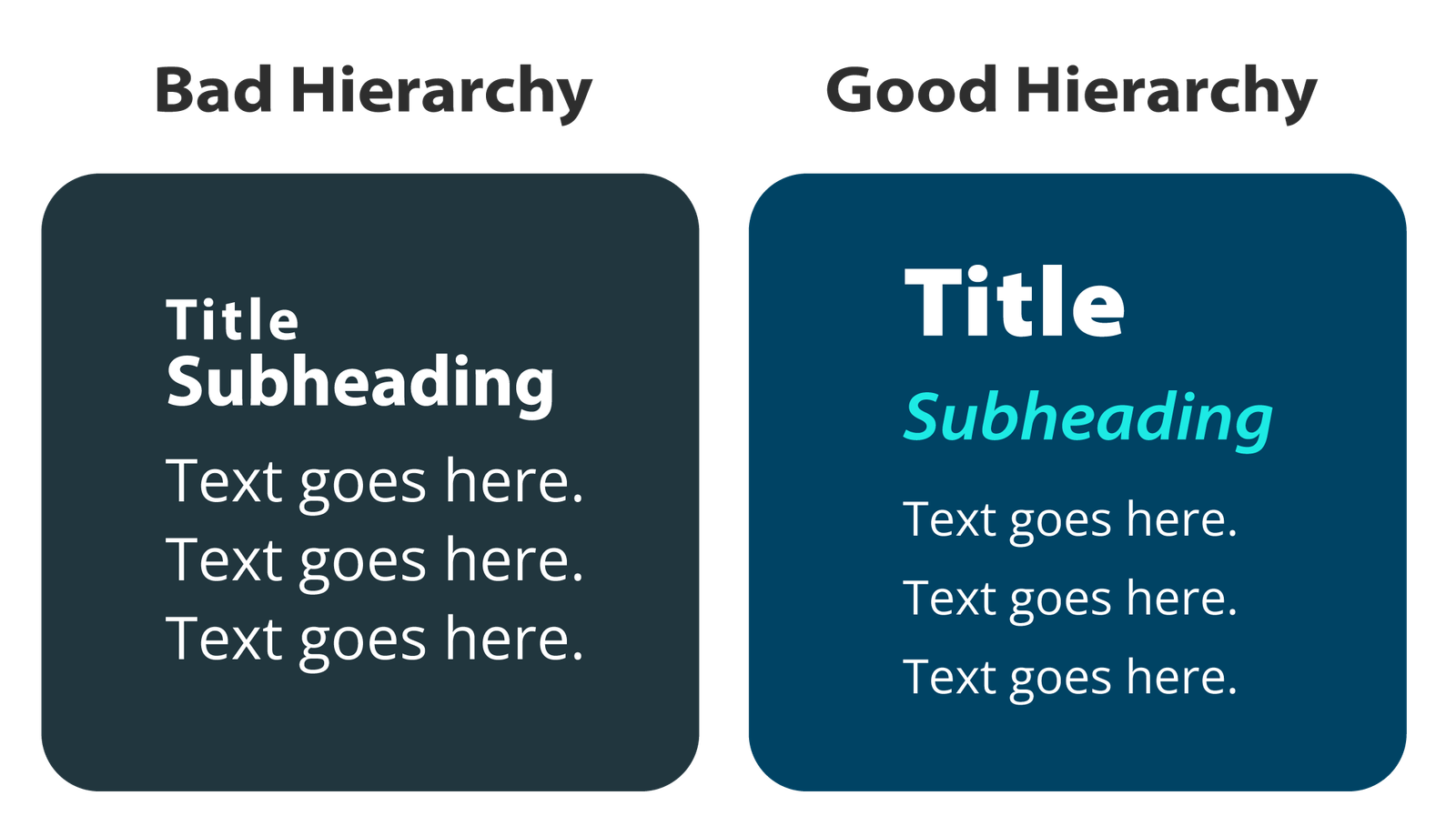
Diagram illustrating “good” versus “bad” hierarchy.
♦️ Pro move: Use size, weight, and spacing to create a visual path. If someone can glance at your slide and know exactly where to start, you’ve nailed the hierarchy.
Final Thoughts (aka The Pep Talk)
Good design isn’t about being fancy. It’s about being clear, intentional, and inclusive. And when your eLearning looks professional, it feels more valuable. This helps you stand out in a crowded market (and yes, justifies those higher rates).
So, next time you crack open a new project, remember your design squad:
contrast, alignment, proximity, white space, balance, repetition, and hierarchy. Each one quietly pulls its weight to make your content intuitive, polished, and accessible to everyone.
Now go forth and design like the creative unicorn you are. ✨
Got a course that’s feeling clunky, or just want to swap design best practices? I’m all ears.